
Bubble.io is a visual programming language and a No Code Cloud platform. It lets you build web applications without programming. As a result, Bubble gives us the flexibility to create responsive pages in Bubble.io with full responsiveness. In other words, the pages adjust automatically to the width of the device they appear on. Hence it gives out-of-the-box responsive functionality, and that makes us prefer it over other platforms. For wider needs, see our web development services.
Want to know how? Keep reading.
Build More Effective Responsive Pages in Bubble.io
When we create an application on any platform, the main concern is “How to make the application fully responsive?”.
We can build more effective web pages in Bubble.io by using its responsive viewer. A responsive application is very necessary. That is to say, we have to make applications for all screens, like mobile browsers, tablets, laptops, and desktops. Bubble already builds pages with responsiveness.
In other words, we can say Bubble.io adjusts the page automatically to the width of the device. First, start creating the pages for widescreens like desktop screens.
After the design of the widescreen, you can start to update web pages for the narrower designs. In Bubble.io, creating a responsive web page is very easy. You just manage the height and width of the page containers and group them.
Along with this, we can create a full-width page and a responsive page at the same time. Also, we can check in the Responsive Viewer whether the webpage is responsive.
Using Bubble.io Responsive Viewer to Develop Web Application
Most importantly, use the Responsive Viewer to make Bubble.io applications responsive. Two tabs sit on top of the new element palette. One is for the UI Builder and one is for the Responsive Viewer. They let you switch between the two. First, with the Responsive Viewer, Bubble.io developers check their web application pages. This shows how the pages respond in mobile, tablet, laptop or desktop view. The Responsive Viewer has a ruler at the top of the page, which shows the current page width. With it, developers can change the application width to different sizes.
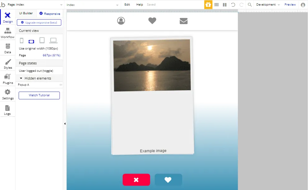
By clicking and dragging the ruler, developers resize their Bubble.io application pages and see how the web pages behave dynamically. Below the Responsive Viewer, a current-view icon lets developers see their web pages in mobile portrait, mobile, tablet, and laptop or desktop mode.
In Bubble.io, we can also click on an element and see its parameters in the responsive palette. Then we can modify more settings and see the result in real time. Bubble.io experts use the Responsive Viewer to make applications responsive and more effective for all devices.
Algorithm to Develop Responsive Bubble.io Application
However, to develop a responsive Bubble.io application, you have to understand how the Responsive Viewer algorithm works. The algorithm that controls the page follows a few core principles. You can tweak the responsive parameters and see the effect in real time. Still, it is good to know in general how the rendering engine works.
When a page resizes in mobile view or tablet view, the elements shrink and expand as the margins expand. When all the elements in Bubble.io are on a line and at their maximum width, the page expands its margin.
There are shrinkable and expandable elements in Bubble.io by default. Responsive Viewer or Property Editor can control it on an element-by-element basis.
Elements and Groups
In the Bubble.io applications we use many elements and groups to develop the web pages. If we don’t make the elements responsive, they overlap each other and shrink and expand together. To fix this, give a fixed width or full width to one of the elements. Then, when you resize the page, the second element moves to the line below. You can also use hide and show conditions for overlapping elements.
In the Bubble.io application we also use normal groups and repeating groups as well. These groups work as mini pages of the application. The elements in a group break inside it when the page shrinks. To check the responsiveness of the page, you can manage how far each group squeezes its content. Set a minimum width and a maximum width to limit how wide an element can be. If you don’t want the application page as wide as your screen, put all the elements in a group and give the group full width.
Use the Responsive Debugger to Develop Bubble.io Applications
Bubble.io also launch its Responsive Engine (beta version). With the help of this engine Bubble.io developers can make the web pages more interactive and effective. When we upgrade our application page with the Responsive Engine, it will change our existing page settings and shows all the new settings. The Responsive Engine is the all-new technology and upgraded version of the Bubble.io. Currently this Responsive Engine of bubble.io is in the developing stage it is only the beta version. Not a fully upgraded version. So, there may be many issues blocking bugs and unexpected behavior.
Responsive Engine (beta version)
Bubble.io also launch its Responsive Engine (beta version). With the help of this engine Bubble.io developers can make the web pages more interactive and effective. When we upgrade our application page with the Responsive Engine, it will change our existing page settings and shows all the new settings. The Responsive Engine is the all-new technology and upgraded version of the Bubble.io. Currently this Responsive Engine of bubble.io is in the developing stage it is only the beta version. Not a fully upgraded version. So, there may be many issues blocking bugs and unexpected behavior.
Container Layout Types
Container layout types define the behavior and positioning of the elements. The container layout type applies to all elements, all groups, floating groups, repeating groups, and the page itself. Your page itself is a responsive container that changes for all screen sizes. However, the page shouldn’t have a fixed width. If you fix the width, the page cannot work as responsive. The container layout types are:
- Fixed type
- Align to parent
- Row
- Column
Fixed type
The fixed layout type has the fixed width and height of the element inside it. The fixed-width container doesn’t change with screen size or content size. It stays the same as on the desktop or laptop screen.
Align to parent
The parent container is the outside group or page of the Bubble.io application. Inside the parent container we use the children element, and this parent container divides into 9 parts instead of four. The children element can align to the parent container in any direction top, bottom, right, left, top right, top-left, bottom-right, bottom-left.
Row
The children’s elements in the row container are horizontally aligned. All the child elements are squeezed when the screen size is shrinks
Column
The content in the column is aligned vertically. When the screen size changes and goes to the lower side the elements are stretched or pushed other elements down
- Margins and padding
Elements adjust through margins and padding. By setting margins and padding, we make the web pages responsive and compatible with all screen sizes.
Conclusion
To sum up, Bubble.io is a great choice for rapid web and mobile development projects. Above all, this article shows that making a responsive design in Bubble is fairly simple. Professionals with cross-domain experience in building custom no-code apps can build it in a secure and scalable way.
Reference link
https://manual.Bubble.io/help-guides/building-a-user-interface/building-responsive-pages
Need a website or web app?
We build on WordPress, Webflow, Shopify, Bubble and custom stacks.