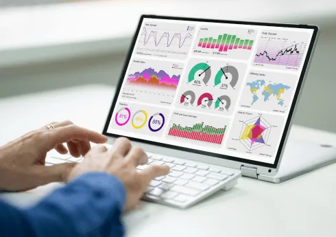
Business dashboard development services have gained tremendous pace, because every business wants to use the power of data analytics. Dashboards make analysis much easier. They present your data as clear visuals on a single screen, like a complete data story. But does your business dashboard story match what you expect to hear?
The fact is, not every dashboard is a perfect storyteller. Storytellers each have their own stories and styles, but they share a way of using their voice. In the same way, your dashboards may present different data. Their designs still need some standard yet unique features to give you the most useful business insights.
Features that Are Important for a Perfect Business Dashboard
When you develop and design a dashboard, keep several elements in mind.
The Perfect Layout
A business dashboard shows your business data right in front of you. So it needs a visual layout that gives the necessary insights at a glance.
Simplicity
You build a business dashboard to make access to your data easier and more flexible. That way, your data analytics become more convenient and efficient. So you want the data to look simple and crisp on the dashboard. Simplicity is the key.
Speed
Speed is a very important factor for an effective dashboard. When you look for business insights, you don’t want to wait. Any delay in analysis can lead to a lost opportunity. So you want a dashboard that shows the data in the form you want within seconds. Design your dashboards with speed in mind.
A perfect mix of all these features creates a business intelligence dashboard that tells great data stories.
How to Make Your Dashboard a Perfect Storyteller?
A few simple things make a BI dashboard tell the best data story. These are the right layout, structure, architecture, and design during dashboard development. Here is what you need to keep in mind.
Follow the 5 Second Rule
A great storyteller knows how to deliver the right content at the right time. Your business dashboard should do the same. It should show the relevant information at the right time, so users can turn the insights into opportunities.
The 5 Second Rule works best here. Ideally, users see the relevant data on your dashboard within 5 seconds. If you design the dashboard well, the data will pop. Users can then take it in at a glance, which saves them time and energy and helps them focus on their goals.
Avoid Visual Clutter
Widgets and plugins add features and functions to your dashboard. Because of that, you may add too many widgets to make the dashboard more advanced and smart. However, that only makes the dashboard messy and too cluttered to understand.
When there are too many widgets, the clutter makes the data harder to read than it was in its raw form. You need to avoid that. Use widgets smartly, so that each one serves a clear purpose with a simple design.
Keep Your Dashboard Minimalist
Minimalism is the key today. You don’t need to add many visuals to a single dashboard just to fit in every piece of information. It will not help you in any way. Instead, it only creates visual clutter, and you want to avoid that at every cost.
A human mind can register only seven to nine representations at once. So that is the most you want on your business dashboard.
Follow the principle of “less is more.” During dashboard design and development, write the code and prepare the designs so that they give more information in fewer visuals.
Plan the Layout
A story always follows a pattern and has a well organized plot. You need to do the same when you design the layout for your dashboard. The layout should tell a story.
The Inverted Pyramid layout is the best choice. Users always want the most important information first, and then they go down the hierarchy. So follow this pattern in your layouts. Keep the most important information at the top. Then add the facts, points, and other details that support it. Keep the bottom section for general details.
This gives users the insights they need from the business dashboard.
The Right Data Visualization is Vital
You don’t create a business dashboard just to show your data in a simple table. You can do that in Excel or Google Sheets as well. A business dashboard has much more meaning, and the right data visualization adds that meaning.
Present the data in attractive and useful formats. Then users can understand it easily and get the insights they need to use the opportunities in front of them.
Conclusion
A BI dashboard helps you use business opportunities through detailed insights into important data and trends. However, to get the best from it, you need to make sure it is a perfect storyteller. You can do that by following the tips and techniques above during any dashboard development.
The best thing you can do is hire dashboard development services from an expert with experience in tools like the Tableau data visualization software or the BIRT reporting tool. Then you can have business dashboards that tell the stories you expect. You can also read about our custom software work.
Have a question about this?
Book a 30-minute call with an engineer who works on it.